SaaS Cohort Analysis Explained
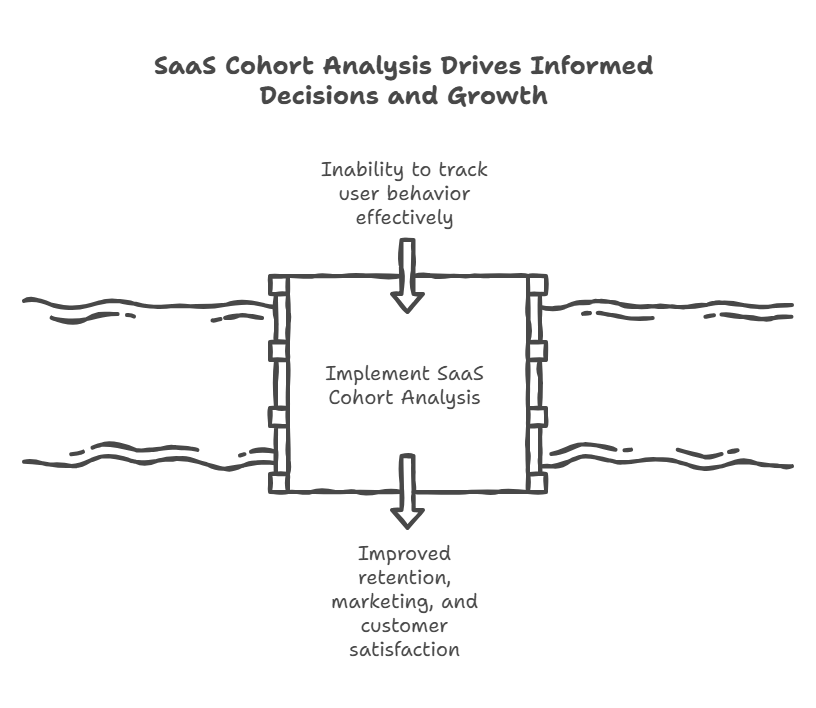
Cohort analysis is how you see whether your SaaS business is actually improving over time or just growing by throwing more money at acquisition. For subscription businesses, especially SaaS, cohort analysis is essential for understanding true SaaS growth—helping you look beyond simple revenue increases to see how customer retention, net revenue retention, and other key metrics drive durable success. By grouping customers by signup date and tracking their behavior over months, you can spot problems like degrading retention, identify which acquisition channels bring better customers, and forecast revenue with actual data instead of wishful thinking. Most companies track aggregate metrics that hide critical trends. Cohort analysis reveals the truth, providing a deeper understanding of your customers’ journeys.
For SaaS companies, having accurate data and tracking key business metrics—such as recurring revenue and churn rates—is crucial for making informed decisions and improving performance. Cohort analysis in SaaS measures how specific user groups behave over time, typically grouped by acquisition month, and tracks key metrics like retention rate, churn rate, monthly or annual recurring revenue, net revenue retention (NRR), and customer lifetime value (LTV).
Introduction to Cohort Analysis
Cohort analysis is a foundational tool for SaaS businesses that want to move beyond surface-level metrics and truly understand their customer base. Instead of looking at all customers as one big group, cohort analysis breaks them into smaller, more meaningful groups—cohorts—based on shared characteristics like signup month or subscription plan. By tracking how each cohort behaves over time, you can spot trends that aggregate numbers miss, such as shifts in customer retention or changes in customer lifetime value. This approach gives you a deeper understanding of your customers’ journeys, helping you identify which strategies actually improve customer retention and drive higher lifetime value. In short, cohort analysis helps SaaS companies make smarter, data-driven decisions that lead to sustainable growth.
Why Aggregate Metrics Lie to You
Every SaaS company tracks overall churn rate. Let’s say yours is 3% monthly. Seems stable. Your board is happy. You’re planning growth based on that number holding steady.
Here’s what aggregate churn hides: Your January cohort is churning at 2%, your March cohort at 4%, your June cohort at 5%. Your overall churn rate looks stable because you’re averaging together cohorts with wildly different behavior. By analyzing different cohorts or user cohorts, you can see how many users from each group engage with your product or churn at various points, revealing patterns that aggregate metrics miss.
We see this constantly with SaaS companies that can’t understand why their growth is slowing despite hitting new customer targets. The answer is usually in cohort data they’re not tracking. Newer customers are retaining worse than older ones, which means unit economics are degrading even as top-line growth looks fine.
Cohort analysis forces you to look at groups of customers who signed up together and compare their behavior over time. Analyzing cohort data and conducting behavioral analysis helps uncover deeper insights, such as identifying specific behaviors that lead to churn, and provides the foundation for forecasting SaaS churn accurately. This reveals whether you’re actually building a better business or just masking problems with growth.
Cohorts can be defined based on acquisition date or user behaviors, allowing you to analyze user cohorts in detail. Understanding these behaviors enables businesses to improve customer retention by enhancing onboarding processes or increasing engagement with key features.
Types of Cohorts
Choosing the right type of cohort is crucial for effective cohort analysis. The most common are acquisition cohorts, which group customers by when they first signed up—perfect for tracking how different signup periods perform over time. Behavioral cohorts, on the other hand, group customers based on specific actions they’ve taken, such as using a particular feature or reaching a usage milestone. Predictive cohorts leverage analytics to forecast future customer behavior, helping you anticipate churn or expansion opportunities before they happen. By grouping customers in these different ways, you can analyze customer behavior more precisely, optimize customer acquisition costs, and drive revenue growth. Many SaaS businesses use cohort analysis templates to streamline this process and ensure consistent, actionable insights from their cohort data.
Benefits of Cohort Analysis
Cohort analysis delivers a range of benefits that go far beyond what aggregate metrics can offer. By analyzing cohort data, you can identify patterns in customer behavior that inform everything from marketing efforts to product development. This approach makes it easier to understand customer churn and retention, so you can develop targeted strategies to improve these critical metrics. Cohort analysis also reveals insights into customer lifetime value, helping you make smarter decisions about pricing, acquisition channels, and resource allocation. Ultimately, cohort analysis helps you identify trends that drive revenue growth and maximize the lifetime value of your customer base, giving you a competitive edge in the SaaS market.
How to Build Cohort Tables That Actually Work
Start with the simplest version: a cohort table showing retention by signup month. Each row is a cohort (customers who signed up in a specific month), and each column represents months since signup. The cohort table allows for retention analysis by particular month and previous month, helping you track how each group of users behaves over time.
Here’s what it looks like:
Cohort | Month 0 | Month 1 | Month 3 | Month 6 | Month 12
Jan 2024 | 100% | 94% | 89% | 85% | 81%
Feb 2024 | 100% | 95% | 91% | 87% | –
Mar 2024 | 100% | 93% | 88% | 84% | –
Apr 2024 | 100% | 92% | 86% | – | –
Read this cohort table horizontally to see individual cohort behavior by particular month. For example, the January cohort retained 94% of customers after one month, 89% after three months. Read it vertically to compare cohorts at the same point in their lifecycle, such as comparing the retention rate of the April cohort to January at month 1 or the previous month. To further enhance your analysis, use a cohort chart to visualize cohort retention and retention rate over time, making it easier to spot trends and anomalies.
If newer cohorts show worse retention than older ones at equivalent points, you have a problem. Either product-market fit is degrading, you’re acquiring worse-fit customers, or something in your onboarding broke.
If newer cohorts retain better, that’s validation that you’re improving. Maybe you fixed bugs, improved onboarding, or started targeting better customers.
Build this cohort table monthly. Track logo retention (percentage of customers who remain) and revenue retention (percentage of revenue that remains after accounting for churn and expansion). These tell different stories and are the core inputs for modeling NRR and GRR accurately. You might lose 15% of customers but retain 105% of revenue because the customers who stay are expanding.
The Retention Curve That Predicts Your Future
Every SaaS product has a retention curve shape. The retention rate is the percentage of users from a cohort still active after a specific time. Most show high early churn in months 1-3 as poor-fit customers self-select out, then flattening as you reach customers who are getting real value. A flattening retention curve is a positive sign, indicating customer loyalty and strong product-market fit.
A healthy B2B SaaS retention curve might look like: 95% month 1, 91% month 3, 88% month 6, 85% month 12, 83% month 24. The curve flattens because customers who make it past month 6 are sticky. High-performing SaaS companies aim for an 85–90% retention rate for monthly active users.
An unhealthy curve never flattens. You lose 5% every month indefinitely. That signals fundamental product-market fit issues. If customers keep churning at constant rates forever, you don’t have a retention problem, you have a value problem.
The shape of your retention curve predicts your business trajectory. A company with flattening curves can afford longer CAC payback periods because customers who survive onboarding stick around for years. A company with linear decay curves needs sub-12-month payback because customer lifetime is short.
Plot your cohort data as curves, not just tables. This process is called retention analysis and cohort retention visualization. The visual pattern in a cohort chart reveals things that tables hide. We worked with a SaaS company whose tables looked fine but whose curves showed a concerning pattern: every cohort had a secondary churn spike at month 8. Turned out their annual contracts came up for renewal at month 8 (they gave everyone 4 months free to start), and they’d built no renewal motion. We fixed that, and month 8 retention improved from 78% to 92%.
Revenue Cohorts and Customer Lifetime Value: What Actually Matters
Logo retention tells you how many customers stay. Revenue retention tells you how much money stays. For most SaaS businesses, revenue retention matters infinitely more.
Build a revenue cohort analysis table showing monthly recurring revenue (MRR) and recurring revenue by cohort over time:
Cohort | Month 0 | Month 1 | Month 3 | Month 6 | Month 12 Jan 2024 | $50K | $49K | $51K | $54K | $59K Feb 2024 | $52K | $51K | $53K | $57K | – Mar 2024 | $48K | $46K | $47K | $51K | –
The January cohort started with $50K MRR, dropped to $49K in month 1 (some churn), recovered to $51K by month 3 (expansion offset more churn), and is now at $59K in month 12. That’s 118% net revenue retention for that cohort. Monthly/annual recurring revenue (MRR/ARR) tracks how revenue from a specific cohort changes over time.
This reveals expansion patterns that logo retention hides completely. You might be losing 10% of customers but growing recurring revenue by 20% because the customers who stay are expanding aggressively. Or you might retain 95% of customers but see recurring revenue decay to 85% because customers are downgrading.
Calculate net revenue retention (NRR) for each cohort: ending MRR divided by starting MRR. NRR measures revenue kept from a cohort, including expansions and contractions. Best-in-class SaaS companies target a Net Revenue Retention (NRR) of 120% or more. Track this as a separate metric. A company with 90% logo retention but 115% net revenue retention has a very different business than one with 90% logo retention and 90% net revenue retention.
Enterprise SaaS companies should track revenue cohorts more carefully than logo cohorts. Losing one $100K customer matters more than retaining ten $1K customers.
Customer cohort analysis is essential for understanding revenue trends, optimizing retention strategies, and improving long-term SaaS business health, and it directly supports initiatives focused on improving SaaS gross retention.
Time Based Cohorts Analysis
Time-based cohorts analysis is all about grouping customers by when they joined—such as by month or quarter—and tracking their retention and revenue over time. This method is especially valuable for understanding revenue durability and customer retention, as it shows how specific cohorts perform long after acquisition and provides the raw inputs for deeper SaaS cohort retention metrics and analysis. By analyzing time-based cohorts, you can pinpoint churn rates and retention rates for each group, which is essential for planning effective marketing campaigns and customer success initiatives. This analysis also answers key questions like how many customers are sticking around and how much revenue each cohort is generating as they age, giving you a clear picture of your business’s long-term health.
Segmented Cohorts: Where the Real Insights Live
Don’t stop at simple time-based cohorts. Segment by anything that might affect behavior: acquisition channel, customer size, industry, product tier, geography. Analyzing customer cohorts—groups of customers sharing characteristics like signup time or acquisition channel—lets you compare multiple cohorts side by side to identify trends and optimize strategies.
Build separate cohort tables for customers acquired through different channels:
Organic Search Cohorts: Month 1 retention 96%, Month 12 retention 89%
Paid Search Cohorts: Month 1 retention 91%, Month 12 retention 78%
Direct Sales Cohorts: Month 1 retention 98%, Month 12 retention 94%
Establishing a baseline with acquisition cohorts allows for standard comparison over time, helping you track improvements or declines in retention and other key metrics.
This tells you which channels bring customers who stick around. Organic and direct sales customers retain well. Paid search customers churn faster. Now you know where to invest acquisition dollars.
Segment by customer size:
Under $100 MRR: Month 12 retention 65%
$100-500 MRR: Month 12 retention 83%
$500+ MRR: Month 12 retention 91%
When you analyze certain cohorts, such as those segmented by customer size or product tier, you can see how different pricing plans impact retention, customer lifetime value (CLV), and acquisition costs, and how those dynamics interact with your customer acquisition cost (CAC) calculations. Small customers churn much faster than large ones. This informs pricing strategy, what features to build, and where sales resources should focus.
Segment by everything you track. Some segments will show surprisingly different behavior. We found a client whose customers acquired during Q4 retained 15% better than Q2/Q3 acquisitions. Turned out Q4 customers were coming in through end-of-year budget spend and were more committed buyers. They adjusted their sales strategy to front-load effort in Q4.
Additionally, tracking feature adoption rate within customer cohorts measures the percentage of users in a cohort engaging with specific features, validating product-led growth strategies and highlighting which features drive retention in multiple cohorts.
Using Cohorts to Forecast Revenue
Cohort data lets you forecast revenue bottom-up instead of top-down. Instead of saying “we’ll grow 30% this year,” you use acquisition cohort analysis to model exactly what happens to each cohort, tracking new users acquired in each period, and you can pair this with a simple model for predicting MRR growth to keep forecasts understandable and reliable.
Take your retention curves, apply them to existing cohorts to project their future revenue. Take your expected new customer acquisition, apply historical retention curves to project their contribution. Analyze when users churn within each cohort and how this impacts your forecasts and retention strategies. Add it all up.
This produces much more accurate forecasts than trend-based projections because it accounts for cohort aging. A company with 100 customers and 3% churn faces different dynamics than one with 1000 customers and 3% churn because the cohort composition differs.
Build a model that: 1. Lists every active cohort with their current MRR 2. Projects each cohort forward using retention curves 3. Adds new cohorts from your acquisition plan 4. Applies retention curves to new cohorts based on their expected attributes
This approach also allows you to calculate the Customer Acquisition Cost (CAC) payback period for each cohort—measuring how many months it takes for a cohort to generate enough revenue to cover its acquisition costs, which is critical for forecasting cash flow, reducing burn without slowing SaaS growth, and optimizing growth strategies.
This tells you realistic revenue growth rates. We’ve seen companies project 100% growth based on doubling new acquisitions, then realize through cohort modeling that they’d only hit 60% growth because existing customer decay offsets new revenue more than they expected.
The Cohort Health Check
Run this analysis monthly to spot problems early:
Track behavioral metrics and product usage as part of your cohort health check. Compare newest cohort to cohort from 6 months ago at month 1. Is retention improving or degrading? If the newest cohort is retaining worse than the cohort from six months ago, something changed for the worse.
Look for sudden breaks in retention curves. If all cohorts show consistent patterns except one, something happened that month. Maybe you launched a broken feature, changed pricing, or adjusted targeting.
Check if expansion is accelerating or slowing. Are recent cohorts expanding faster at month 6 than older cohorts did at month 6? That suggests improving product-market fit.
Verify that longer-tenured cohorts are still contributing revenue growth. If your year-old cohorts are stagnant while newer cohorts are expanding, you have different value props for new customers versus existing ones.
Marketing teams can leverage these insights from cohort analysis to optimize campaigns, track key performance indicators, and identify customer behavior patterns. Behavioral cohorts are particularly useful for identifying which user actions lead to higher retention rates, enabling companies to promote successful behaviors among at-risk users and to design SaaS KPIs for product-led growth that are tightly aligned with real product usage.
What Good Cohort Analysis Actually Looks Like
Companies that master saas cohort analysis have monthly dashboards showing: – Logo retention curves for the last 12 monthly cohorts – Revenue retention curves for the same cohorts – Net revenue retention by cohort with trend lines – Segmented customer cohorts for each major customer attribute – Cohort-based revenue forecasts. These dashboards often utilize a cohort analysis template and cohort chart to visualize and analyze cohort data, making it easier to track customer behaviors, revenue, and retention patterns over time.
They review this data in management meetings alongside new acquisition metrics. When retention degrades, they investigate immediately rather than waiting for aggregate churn to spike.
By leveraging behavioral analysis and segmenting customer cohorts, companies can better understand how different groups interact with their product or service. Understanding which customer cohorts yield the highest CLV allows businesses to tailor their marketing strategies and product offerings to attract similar high-value customers. Additionally, analyzing customer behaviors and characteristics through cohort analysis helps identify factors that contribute to higher CLV, enabling optimization of services and engagement strategies.
They use cohort insights to inform acquisition strategy (which channels bring better customers?), product roadmap (what features increase retention?), and pricing (which segments have best unit economics?).
Most importantly, they understand that a few percentage points of retention improvement compound into enormous valuation differences. Improving month 3 retention from 88% to 91% means more customers survive to become long-term revenue, which also amplifies the impact of healthy SaaS gross margin targets on profitability. Do that across all cohorts and your business value increases by millions, especially when your SaaS headcount planning model is aligned with these retention-driven revenue realities.
FAQ
Q: How far back should we track cohorts?
Track as far back as your data allows, but focus analysis on the last 12-24 months. Tracking cohort retention over time is crucial for understanding how user engagement evolves. Older cohorts tell you historical patterns but may not reflect current product or market conditions. For forecasting, use retention curves from cohorts in the last 12 months since they best represent current customer behavior. If you’re pre-revenue or very early stage, you need at least 6 months of cohorts before patterns become meaningful.
Q: Should we track monthly or quarterly cohorts?
Monthly for the first 24 months of customer lifecycle, quarterly after that. Use acquisition cohorts to group users by their signup month and compare their behavior over time. Monthly granularity reveals early retention patterns and lets you spot problems quickly, especially when comparing each cohort’s performance to the previous month. After month 24, customer behavior stabilizes enough that quarterly tracking works fine. If you have low customer volume (under 20 new customers monthly), quarterly cohorts might be necessary to have statistical significance.
Q: What do we do when cohort analysis shows retention is getting worse?
First, segment to isolate the problem. Is it specific to a channel, customer size, or product tier? Second, look for correlation with product changes, pricing adjustments, or targeting shifts. Third, run qualitative analysis with churned customers to understand why. Fourth, implement fixes and monitor whether subsequent cohorts improve. Retention analysis plays a key role in identifying and addressing retention issues. The key is acting fast—retention problems compound. A cohort that’s retaining 5% worse at month 3 might retain 15% worse at month 12.
Conclusion and Next Steps
Cohort analysis is one of the most powerful tools available to SaaS businesses aiming for sustainable revenue growth and improved customer retention. By grouping customers into cohorts and tracking their behavior over time, you gain actionable insights into customer lifetime value, churn, and the true drivers of your SaaS metrics. To get started, define your business goals, select the cohort types that align with those objectives, and leverage analytics tools to build accurate cohort tables and retention reports. Mastering cohort analysis will help you improve customer retention, reduce churn, and increase revenue durability—key ingredients for long-term SaaS success. Focus on these fundamentals, and you’ll be well on your way to building a stronger, more resilient business.
