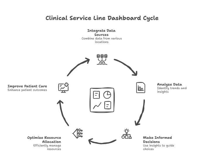
How to Build a Multi-Location Healthcare Dashboard (A CFO Framework for Turning Data Into Scalable Operational Intelligence)
Multi-location healthcare and medspa organizations fail not because of clinical issues, but because leaders can’t see what’s actually happening across locations, providers, service lines, and capacity. Building an effective healthcare dashboard is essential for scalable operational intelligence. A clinical service line dashboard is a centralized, visual analytics tool that tracks key performance indicators (KPIs) for specific care areas in real time. A hospital operations dashboard is a comprehensive, data-driven interface that integrates operational metrics such as patient flow, staffing, resource utilization, and supply chain management to improve overall hospital efficiency. A true multi-site dashboard consolidates clinical, operational, and financial data into one system of truth—revealing utilization, revenue per hour, provider performance, membership health, staffing leverage, margin leakage, and cash risks. Relying on separate systems can hinder efficient data analysis and decision-making, making integration crucial. When built correctly, this dashboard becomes the “operating cockpit” that enables predictable scaling.
Modern dashboards can reduce manual reporting time by up to 70%, allowing staff to focus more on direct patient care. Integrated dashboards are especially critical during health crises, as they support timely decision-making in rapidly changing or emergency situations.
Why Most Multi-Location Dashboards Fail for Healthcare Organizations
We see the same problems across healthcare groups, medspas, dental organizations, allied health, and hybrid practices.
1. Each location tracks metrics differentlyDifferent EMR setups. Different Excel sheets. Different definitions of “a visit.”
2. Dashboards don’t tie to financial outcomesOperators look at appointments and revenue, but not: – Contribution margin – Provider utilization – Revenue per room hour – Service mix – Membership liability
3. Leaders get reports too lateIf you receive reports on the 20th of the following month, you aren’t managing—you’re autopsying.
4. Providers never see their performance metricsWhich means behavior never changes. And profitability never improves.
**5. Corporate and location teams argue over “whose data is correct”**Because no single system connects EMR → CRM → scheduling → POS → accounting, managing information becomes challenging when systems are separate and not connected.
Many healthcare organizations face challenges in building effective dashboards due to underlying data issues, which can lead to dashboards that lack trust, consistency, and relevance. Integrated clinical service line dashboards support operational decision making by providing real-time data on inventory and performance metrics, enabling healthcare leaders to make informed decisions that enhance efficiency and compliance.
Establishing a strong framework for data accuracy and security is essential for building trust among clinicians and complying with privacy regulations.
A multi-location dashboard solves these problems by creating:
One Source of Truth that everyone uses to run the business.
The 5 Core Questions a Multi-Location Dashboard Must Answer
Every growing healthcare organization must be able to answer:
Tracking important metrics across clinical, operational, and financial domains is essential to answer these questions effectively. Metrics such as length of stay, average length of stay, and discharge status are critical for measuring operational efficiency and care quality.
1. Are locations operating efficiently?– Revenue per room
– EBITDA per location – Patient flow metrics
Monitoring emergency department wait times and average length of stay helps streamline throughput and reduce discharge delays.
2. Are providers performing at expected yield?
– Utilization – Rebooking – Service mix – Membership conversion, supported by robust provider productivity modeling focused on revenue per clinical hour
3. Are we generating profitable service mix?– Margin by service line – High-margin vs low-margin hours – Underutilized devices, all of which are core levers in improving provider profitability without adding staff
4. Is membership revenue stable and predictable?– Churn – Liability – Utilization – Add-on revenue
5. Are we scaling sustainably?– Staffing leverage – Marketing efficiency – Cash runway – Ramp curves for new staff and new locations
If your dashboard cannot do this, you’re operating blind.
Monitoring these important metrics not only helps measure performance but also supports efficient, patient-centered service delivery by aligning operational processes and improving the quality of care provided.
The 9 Dashboard Modules Every Multi-Location Healthcare Group Needs
There are three primary types of healthcare dashboards: clinical, operational, and financial, each serving distinct purposes within healthcare organizations. Modern healthcare dashboards are designed to support value-based care by aligning metrics with high-quality, cost-efficient patient care.
We build modern healthcare dashboards in nine interconnected modules that together provide a complete, integrated view of clinical, operational, and financial performance. Actionable dashboard design focuses on manageable metrics to avoid information overload and highlight areas needing immediate attention.
1. Daily Revenue & Booking Dashboard
This dashboard shows: – Daily revenue by location – Booked revenue vs goal – Appointment volume – Same-day fills & cancellations – Booking pace for next 14–30 days
Key Insights:
– Identifies underperforming days early – Allows mid-week schedule optimization – Reveals which locations struggle with fill rates – Aligns leaders on weekly pacing
CFO Insight:
Revenue is lagging. Booking is leading. Your dashboard must show both.
2. Provider Performance Dashboard
Providers are the core revenue engines of healthcare.
KPIs:– Utilization (goal: 75–85%) – Revenue per clinical hour – Revenue per day – Rebooking rate – Retail attachment rate – Membership conversion – New vs returning patient ratio
**Why it matters:**This dashboard identifies: – Underperforming providers before it affects EBITDA – Providers who need training – Providers who deserve schedule expansion – When to hire the next provider. Tracking patient vitals is essential for real-time clinical monitoring and decision-making. Additionally, provider performance dashboards help track and evaluate treatment plans, adherence, and related health outcomes, supporting improved patient care and clinical decision-making. Clinical dashboards also provide insights into treatment outcomes, patient data, and infection monitoring, helping healthcare providers track metrics that drive quality care.
CFO Insight: Most providers can increase revenue 20–40% through behavioral changes—not additional staff.
3. Room Utilization Dashboard
Rooms are fixed, expensive assets; low utilization kills profitability.
Metrics:– Room hours available – Room hours used – % utilization by day of week – Idle time gaps – Overlaps by provider – Turnover times
Insights:– Do we need more rooms or better scheduling? – Are injectors waiting for rooms? – Are aestheticians overusing long treatments? Monitoring provider performance and room utilization also supports better patient care by ensuring resources are allocated efficiently and treatment plans are followed.
Room utilization is often lower than 55% in multi-location practices—far below profitability targets.
4. Service Line Profitability Dashboard
Each service line should be a financial product line.
Metrics:– Revenue per service line
– Consumable costs – Labor cost fraction – Revenue per hour – Device utilization and ROI – Profit per room hour – Cost per treatment
Insights:– Which service lines drive profit – Which destroy margin – Which need price changes – Which should be removed – How to rebalance marketing spend
Monitoring service line profitability and cost per treatment supports long-term financial sustainability by helping healthcare organizations identify opportunities for cost containment and efficiency improvements. Monitoring staffing costs and reducing costs are essential for maintaining operational efficiency and ensuring long-term financial sustainability. Cost per treatment is a key financial performance metric that totals direct and indirect costs for each procedure, enabling analysis of efficiency and cost-effectiveness. Financial dashboards in healthcare also monitor key financial metrics, including revenue cycle performance and cost per patient, to support strategic financial planning.
This dashboard exposes the economic engine of the business and highlights the financial KPIs every practice manager must know.
5. Membership & Recurring Revenue Dashboard
Accurately tracking recurring revenue depends on patient volume forecasting that connects demand, capacity, and seasonality.
Memberships stabilize revenue—but only when modeled correctly.
Metrics:
– New member adds – Churn – Active member count – Deferred revenue balance – Monthly recurring revenue (MRR) – Entitlement utilization – Add-on revenue per member – Lifetime value
Insights:
– True profitability of the membership program – Liability risk from unused entitlements – Which locations convert best – Whether membership growth supports expansion
Many medspas lose money on memberships because they don’t track these metrics.
6. Patient Experience & Conversion Dashboard
Patient behavior drives future revenue, and provider schedules must be designed around maximizing provider utilization metrics across locations.
Patient behavior drives future revenue.
Metrics: – New patient conversion – Consult-to-treatment rate – Review scores – Rebooking rate – Cancellation & no-show rate – Wait times – Lead response time – Patient satisfaction – Patient satisfaction scores – Readmission trends (to monitor patient outcomes and hospital performance over time)
Insights: – Where the patient journey breaks – Which providers convert best – Where front desk staffing models need adjustment – How marketing dollars translate into treatment revenue – Tracking patient satisfaction scores can reveal long-term trends and gaps in care, enabling targeted improvements that enhance patient experiences and outcomes
7. Location P&L & Financial Health Dashboard (Real-Time Financial Performance)
Each location must operate as its own business unit.
**Financial Dashboards:**Financial dashboards provide critical insights into the organization’s financial health by integrating clinical, operational, and financial data. Monitoring the organization’s financial health through dashboards is essential for understanding overall stability and making informed decisions to optimize financial outcomes. These dashboards help healthcare management assess performance, support cost management, and facilitate strategic planning.
Metrics:– Revenue
– COGS / consumables
– Direct labor
– Contribution margin
– Fixed overhead
– EBITDA
– EBITDA %
– Labor-to-revenue ratio
– Accounts receivable days
– Claim denial rate
– Patient billing turnaround time
– Collection rates
– Market share
Insights:– Which locations are profitable
– Which are struggling
– Whether a location deserves more marketing
– Whether to restructure staffing
– Whether to consider closure or relocation
– How market share compares to competitors and where growth opportunities exist
Key performance indicators (KPIs) tracked in financial dashboards, such as accounts receivable days, claim denial rate, patient billing turnaround time, and collection rates, provide a comprehensive view of revenue flow and mirror the structure of multi-site healthcare financial reporting frameworks. Financial dashboards help monitor the cost of care, manage revenue cycles, and maintain healthy cash flow.
**CFO Insight:**Most multi-location organizations have 1–2 profitable locations and 1–2 dragging down the entire company.
Dashboards expose this instantly.
8. Corporate Overhead Dashboard
This dashboard shows: – Marketing efficiency – Billing performance – Finance performance – Recruiting & HR metrics – IT & system uptime
Key Ratios:
– Corporate FTE per provider – Corporate cost per location – Corporate overhead as % of revenue (target: 7–12%)
Insights:
– Overbuilt HQ teams – Gaps in billing or revenue cycle – Inefficient recruiting workflows – Bloat from unused software tools
Corporate overhead often grows faster than revenue unless controlled.
9. Strategic / FP&A Dashboard (Forecasting & Scenario Planning)
This module effectively operationalizes an end-to-end healthcare FP&A discipline for multi-site groups.
This dashboard answers:
Forecasting:– What will revenue be next month? – What will cash be in 90 days? – When will this new injector ramp? – When does the new location break even?
By leveraging predictive analytics, healthcare dashboards can forecast trends based on past and current data, helping organizations monitor ongoing health situations and prepare for future demands, similar to how leading-indicator dashboards are used to predict SaaS demand. Integrated dashboards also provide population health insights that support public health officials in long-term planning and public health decision-making.
Scenario Planning:– Pricing changes – Adding a room – Adding providers – Membership strategy – Device purchases – Marketing budget changes
This is where strategic decisions are made intelligently—not emotionally.
Data Sources: Building a Reliable Foundation
For healthcare organizations aiming to scale and improve operational efficiency, the quality of your dashboard is only as strong as the data foundation beneath it. Effective healthcare dashboards depend on integrating accurate, comprehensive data from every corner of your operations—transforming complex data into actionable insights that drive better decisions.
The most impactful dashboards draw from several core data sources:
- Electronic Health Records (EHRs): EHRs are the backbone of patient data, capturing everything from patient demographics and visit histories to treatment outcomes and clinical notes. This data is essential for tracking health outcomes, monitoring patient flow, and supporting quality care initiatives.
- Patient Billing Systems: Billing platforms provide critical financial data, including revenue cycles, claim status, payment delays, and patient billing trends. This information is vital for understanding your organization’s financial health, identifying cash flow risks, and optimizing patient billing processes.
- Operational Systems: Scheduling, resource allocation, and supply chain applications all feed into operational systems. These sources reveal patterns in room utilization, staffing levels, bed availability, and medical supplies—enabling healthcare providers to optimize resource utilization and improve patient flow. Visualizing bed occupancy and staff-to-patient ratios helps leaders allocate resources where demand is highest.
- Emergency Room Data: Emergency room metrics are essential for monitoring patient flow, wait times, and operational efficiency. Including emergency room data in your dashboard supports decision-making and streamlines hospital operations.
- Financial Data: Pulling from accounting and ERP systems, financial data offers a clear view of direct costs, indirect costs, profitability by service line, and overall financial performance. This is crucial for tracking key performance indicators, forecasting trends, and supporting informed decisions at every level.
- Infection Control Dashboards: Specialized dashboards track hospital-acquired infection (HAI) rates and antibiotic usage, supporting infection control initiatives and improving patient safety.
By consolidating these diverse data sources into a centralized location, healthcare organizations can identify trends, monitor key metrics, and make timely decisions that improve patient outcomes and operational performance. A reliable data foundation ensures your healthcare dashboard delivers the actionable insights needed to drive sustainable growth and deliver quality care across every location.
Designing an Effective Healthcare Dashboard
For healthcare organizations striving to deliver quality care while maintaining operational efficiency and financial health, the design of your healthcare dashboard is mission-critical. An effective healthcare dashboard transforms complex healthcare data into actionable insights, empowering healthcare professionals to make timely, informed decisions that directly impact patient satisfaction scores, treatment outcomes, and patient flow.
The foundation of any successful dashboard is data accuracy and reliability. By integrating data from electronic health records, clinical dashboards, and operational systems, organizations ensure that key performance indicators (KPIs) reflect real-time realities across all service lines and locations. This integration allows healthcare providers to monitor patient satisfaction, track treatment outcomes, and optimize operational efficiency—all from a centralized location.
A well-designed dashboard should be intuitive and role-specific, presenting only the most relevant KPIs to each user. For example, clinicians may focus on patient satisfaction scores and treatment outcomes, while operational leaders monitor patient flow and resource utilization. Financial teams, meanwhile, can track metrics that reflect the organization’s financial health, such as revenue per patient and cost per treatment.
Visualization is equally important. Effective healthcare dashboards use clear charts, color-coded alerts, and trend lines to highlight areas needing attention, enabling healthcare professionals to quickly identify trends and intervene before issues escalate. By surfacing actionable insights, dashboards help teams improve patient satisfaction, streamline patient flow, and enhance overall operational performance.
Ultimately, the goal of dashboard design is to support better decision-making at every level of the organization. When healthcare dashboards are built on accurate healthcare data and aligned with strategic KPIs, they become indispensable tools for improving patient outcomes, boosting operational efficiency, and safeguarding the financial health of healthcare organizations.
Architecture: How to Build a Multi-Location Dashboard That Works
A powerful dashboard requires an integrated data system. Integrated healthcare dashboards unify data from electronic health records (EHRs), ERP platforms, billing systems, and operational tools, providing a centralized view that enhances decision-making in healthcare organizations. By consolidating information from separate systems, integrated dashboards overcome the inefficiencies and data silos that can hinder effective data analysis and timely decision-making.
Data Sources:– EMR / EHR (patient visits, services, providers) – Scheduling system (capacity, utilization) – POS (revenue, payment types) – Accounting / ERP (P&L, COGS, overhead) – Membership platform (recurring revenue, liability) – CRM / call center (lead conversion) – Device logs (usage, ROI, consumables)
Data Flow:1. Extract healthcare data nightly 2. Clean & normalize 3. Build metrics in business intelligence (BI) layer to transform healthcare data into actionable insights 4. Display dashboards in role-specific views
Tools:– Power BI – Tableau – Looker – Metabase – Klipfolio – Snowflake / BigQuery (for advanced setups)
Roles & Permissions:– Owners/CFO: full visibility – Managers: location-level dashboards – Providers: personal scorecards – Front desk: patient flow & conversion – Marketing: lead performance
Dashboards must be simple enough to use daily and powerful enough to drive strategic decisions. These dashboards help healthcare executives understand the connections between patient care, operational efficiency, and financial health, enabling better resource allocation and improved patient outcomes.
Case Study: 7-Location Medspa + Medical Group ($24M Revenue)
Before Dashboard Implementation– Providers did not know their utilization – Marketing ROI unclear – Locations had inconsistent pricing – Membership liability unknown – Multiple conflicting reports – Financials came 20 days after month-end
After Dashboard Implementation– Utilization visible daily – 14-day booking pace tracked systemwide – Pricing inconsistencies eliminated – Membership profitability increased 33% – Device utilization rose 40% – Location-level EBITDA posted weekly – Corporate overhead trimmed by 11%
– Operational dashboards enabled real-time monitoring of patient flow, staffing levels, and average wait times, leading to improved hospital efficiency and resource management.
Results– EBITDA margin: 14% → 23%– Cash reserves: +$1.2M – Provider performance: +18–42% revenue/hr – Scaling readiness: opened 2 new profitable locations
Dashboards became the operating system of the company.
Strategic CFO Insights
**1. Dashboards must drive behavior, not just display data.**Data is useless unless it changes decisions. Integrated dashboards empower healthcare executives by providing strategic visibility and enabling data-driven decisions across clinical, operational, and financial domains.
2. Providers should receive personalized scorecards weekly.
3. Booking pace predicts revenue more reliably than marketing metrics. This is also a critical input when building multi-site healthcare budgets that scale profitably.
4. A dashboard is the only way to scale beyond 3–5 locations without chaos. Central visibility into revenue per provider productivity across sites is what turns that scale into profit.
5. Finance, operations, and clinical leadership must all share the same data. Integrated dashboards allow healthcare teams to move from reactive reporting to informed decision-making by simplifying complex data and providing real-time visibility into key performance indicators across departments.
Healthcare Dashboard FAQs
**1. How long does it take to build a multi-location dashboard?**A strong MVP can be launched in 45–90 days, with ongoing enhancements.
**2. Can a dashboard replace a practice manager?**No—but it makes managers far more effective by showing exactly where to intervene.
**3. What if different locations use different EMRs?**It’s solvable with a data warehouse, but you should standardize platforms as soon as possible.
