KPI Dashboard Design: Building the Metrics That Drive Decisions
in Fractional CFO, Accounting and Finance, Financial Leadership, Fractional CFO Services, Strategic Planning, All Posts
Ask most founders what their KPI dashboard tells them, and you’ll get some version of: “Revenue, and roughly where we stand on cash.”
That’s not a KPI dashboard. That’s a bank balance with a chart around it.
A real KPI dashboard is built around the handful of numbers that actually predict where the business is headed. Those numbers need to be updated on a cadence fast enough to act on and trusted enough that leadership makes decisions from them rather than around them.
Dashboard design is often treated as a formatting exercise: pick some charts, choose some colors, and ship it. The real work happens upstream. It starts with deciding which metrics matter for your specific business model and growth stage, making sure the underlying data is clean enough to trust, and building a structure that can withstand scrutiny from a board member, lender, or buyer’s diligence team.
Get that part wrong, and no amount of visual polish will fix it.
TL;DR
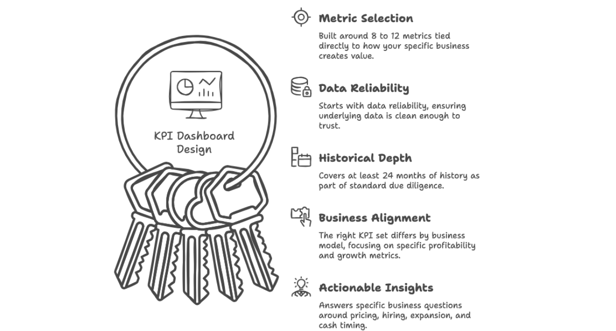
- A good KPI dashboard is built around 8 to 12 metrics tied directly to how your specific business creates value, not a generic template pulled from a SaaS metrics blog.
- Dashboard design starts with data reliability, not visualization. A beautifully designed chart built on unreconciled numbers is worse than no dashboard at all.
- Investors and lenders routinely expect KPI dashboards covering at least 24 months of history as part of standard due diligence. This is a data room requirement, not a nice-to-have.
- The right KPI set differs by business model. Recurring revenue businesses may focus on CAC, LTV, and churn, while CPG and services businesses may need product and customer profitability metrics. Project-based businesses often need utilization and project-level profitability.
- Dashboards should answer specific business questions around pricing, hiring, expansion, and cash timing rather than simply report activity.
Start With the Decision, Not the Metric
The most common mistake in KPI dashboard design is starting with a list of metrics that seem important and then building charts for each one. The result is often a comprehensive but ineffective dashboard with dozens of tiles and no clear indication of what actually matters this week.
A better approach starts with the decisions leadership needs to make.
Are you deciding whether to hire another salesperson? You need pipeline velocity and rep productivity, not just headcount.
Are you deciding whether to raise prices? You need product- or customer-level margin, not just aggregate revenue.
Are you worried about a cash crunch in 60 days? You need a rolling cash flow forecast, not a static balance sheet snapshot from three weeks ago.
This is the same discipline we bring to strategic planning work more broadly. A five-year model, 13-week cash flow, budget-versus-actual analysis, and scenario analysis should all exist to inform specific choices such as whether to hire, expand, or hold. They should not exist simply to fill a slide.
A KPI dashboard should work the same way. If a metric does not change what someone does differently, it does not belong on the primary view, even if the metric itself is interesting.
The Metrics That Matter by Business Model
There is no universal KPI set, but certain patterns consistently appear based on the type of business being managed.
Recurring revenue and subscription businesses. Key metrics include customer acquisition cost (CAC), lifetime value (LTV), churn by cohort, net revenue retention, and CAC payback period. Together, these metrics show whether growth is efficient or whether the business is simply spending its way to a revenue number that could collapse as soon as acquisition spending slows.
CPG and product businesses. These businesses often need customer acquisition cost and return on ad spend by channel, product-level gross margin, inventory turns, and customer concentration.
We built exactly this for a family-owned CPG client. The model combined weekly digital advertising spend with CAC, ROAS, and customer value, alongside a 60-month growth forecast. This gave the owner a real-time view of whether marketing spend was actually producing value rather than relying on a monthly gut check.
Services and project-based businesses. Key metrics include team utilization, project-level profitability, backlog and pipeline coverage, and realized versus billed rates. These businesses live or die by how effectively capacity is deployed, yet that information is often invisible in a standard P&L.
Multi-entity or holding structures. These businesses need entity-level profitability with proper overhead allocation, visibility into intercompany margin flows, and a consolidated enterprise view alongside each entity as a standalone operation.
We handled this directly on an industrial equipment engagement where one entity’s overhead was sitting entirely in a sister company. As a result, the second entity appeared far more profitable than it actually was. That distortion could have misled a buyer within minutes of reviewing the numbers.
Dashboard Design Depends on Data You Can Trust
No dashboard design decision, whether it involves chart type, layout, or refresh frequency, matters if the underlying numbers are unreliable. This is the part that often gets skipped, even though it is usually where the most important work happens.
Before we design a dashboard for a client, we are typically solving problems such as two ERPs that do not communicate with each other, overhead sitting in the wrong entity, revenue and cost of goods being double-counted by a legacy software system, or a CPA making year-end adjustments directly in the books without anyone downstream understanding why.
Every one of those issues can become embedded in the dashboard if it is not resolved first.
A polished chart showing double-counted revenue is still showing double-counted revenue. It is simply harder to catch.
That is why effective dashboard design starts with reconciliation. The process may involve standardizing the chart of accounts, correcting historical entries, building proper overhead allocation, and establishing a single agreed-upon source of truth across every system feeding the business.
Only after that foundation is solid should the visualization layer be built.
In many cases, the visualization is actually the fastest part of the process.
Why This Matters Beyond Internal Reporting
A well-designed KPI dashboard is not just an internal management tool. It is also important data room material.
When a company prepares for a capital raise or a sale, a KPI dashboard covering at least 24 months of history is a standard request from serious buyers and investors. It typically sits alongside revenue-by-segment data, customer concentration analysis, pricing history, and other operating information.
Our internal benchmark for clients is to be able to open a complete data room, including KPI dashboards, with less than 48 hours’ notice.
That standard is not arbitrary.
A buyer’s diligence team will independently reconstruct your key metrics regardless of what you show them. When your dashboard and their independent calculations line up, it builds confidence quickly.
When they do not, even for reasons unrelated to fraud, such as messy historical tracking or inconsistent definitions, the process slows down. That gives the other side more leverage to question the numbers and potentially reprice the deal.
We saw this directly in an exit preparation engagement. A KPI dashboard built on properly reconciled, entity-level data became part of the foundation that allowed the deal to close on its original terms without a valuation re-trade.
Keep It Simple Enough to Actually Use
The failure mode on the other end of the spectrum is the 40-tile dashboard that nobody opens.
Good design requires restraint.
The primary view should surface the 8 to 12 metrics that map directly to the decisions leadership makes regularly. Supporting detail can sit one level deeper for situations where someone needs to investigate a number.
The update cadence should also match the speed of the decision.
Cash and advertising spend may need weekly updates. Margin and retention may be more useful monthly. Board-level strategic metrics may only need to be reviewed quarterly.
A dashboard that updates in real time but nobody looks at is no better than one that is accurate but three weeks stale.
Design for the Audience, Not Just the Metric
The same underlying data often needs to be presented differently depending on who is looking at it.
A founder checking the business daily wants a fast, high-signal view of cash position, advertising efficiency, and anything trending in the wrong direction.
A board member reviewing performance quarterly wants trend lines against plan rather than raw weekly noise.
A lender or investor evaluating the business for the first time wants historical depth, including the 24 months of KPI history that helps them determine whether performance is durable or simply a recent anomaly.
Trying to make one dashboard serve all three audiences equally well is a common design mistake.
A better approach is to build a single, reconciled data layer that feeds multiple views, with each view tailored to how that audience actually makes decisions.
That is a design choice, not a data problem. In practice, it is often the difference between a dashboard that gets used every day and one that only gets opened when someone asks for it.
FAQ
How many KPIs should be on our primary dashboard?
A good starting point is 8 to 12 metrics for the main view, tied to specific decisions leadership makes on a recurring basis. Supporting detail can live one level down for deeper investigation, but the primary view should be scannable in under a minute.
Our numbers come from two different systems that don’t match. Can we still build a dashboard?
Not a trustworthy one yet. The first step is reconciling the two systems, aligning the chart of accounts, eliminating intercompany transactions, and agreeing on a single source of truth. Once that foundation is in place, the dashboard layer typically comes together quickly, often within a few weeks.
Do we need expensive BI software to build a proper KPI dashboard?
No. We’ve built fully functional, investor-grade dashboards using tools that cost as little as $23 a month. In some cases, a well-structured Excel or Power BI model is entirely sufficient. The cost of the software is rarely the constraint; the reliability of the underlying data is.
Assess your CFO needs in 5-minutes

